Showing posts with label Digi Pak Construction. Show all posts

Sunday, 17 March 2013

Album Details

For the digipak, we needed to research all the little components that go into the design across all four panels and the spine. For this I looked closely at the album collection I had in my room - for example I examined the copyright text very closely. By having the albums in front of me I could read every word despite the fact that the text was almost microscopic. For our digipak, we need to make sure that we have all these little details in it to enable it to fit into the market of existing digipaks.

Below is a video (created on 'Animoto') of tracklistings (back panel on album). I looked at several designs and ways of structuring the tracklistings. As it is a single there will only be a few tracks to be put on the back but I looked at how albums do it. I considered factors such as the amount of space used, the structure e.g.) columns, text size, text style, images and house style on the rear cover.


What I discovered is that that there was a variety of ways that the tracklists could be displayed. For example, when looking at the 'R.E.M' cover, they covered the whole of the back using large text in capitals. Compare this with Coldplay's style seen in the albums "A rush of blood to the head" and "Viva La Vida" where the text is centred in small and detailed text which looks rather sophisticated. Where as the R.E.M cover is emphatic and in your face. So there is a wide list of approaches you can go for. The tracklistings are always in the same colour font as the name of the album which is on the front. It is very important that there is a consistent house style used in the design as all four panels have to lead on from each other.


There is a range of ways the background of the last panel is presented. A number of them are dominated by a photograph or graphic of something specific such as the artist, which takes up the majority of the space with the tracklistings in the corner. When the tracklistings are intended on being the focus of the panel, the background is simplistic and frequently plain (as seen above in the two albums shown).


Try our slideshow maker at Animoto.


The copyright details are also shown on ALL album covers and the CD itself as this is a notification of which record label owns the rights for the artist and prevents potential copyright. This is usually printed on the back panel and regularly on the third panel in VERY SMALL text. For example on the Jack Johnson album 'To The Sea' it says, "2010 JACK JOHNSON. The copyright in this sound recording and artwork is owned by Jack Johnson and is exclusively licensed to Universal Records, a division of UMC Recordings INC. All rights reserved. Unauthorized production, copying, hiring, lending, public performance and broadcasting is prohibited. BIEM/SABAM. Made in the EU." It simply highlights the legal points around the outside of the CD itself. This quote is generally the same sort of thing on all albums in terms of the wording.

The barcode is obviously for sales purposes. It is usually placed on the back (fourth panel). The positioning of it differs in the sense that i can be on its side or not. In terms of placement it is 9 times out of 10 along the edge hidden away as it does not carry any style or meaning for the album itself. So it is rather unimportant in terms of design. As long as we put it on there at the required size, that will be fine. As seen here there is some promotional material above it such as the record label's website etc.


Other little things that can be seen on a digipak are touches such as the label logo as seen on the Jack Johnson album which just gives it more of a branding and identity. For our album we can create a record label for this purpose or simply just use the record label that the band use - from whom we took the song for the video (The Naked and Famous)

First Idea


By Matt Dickinson


This is the first idea i had for our music video album cover. The picture is the car we used in some of the filming, especially in the opening shot of the music video.


Planning


Construction


To create this shot i first took a photo of Dom's car when we out on a snowy day (Hence the icy floor) because of the cool lighting form the street lamps. I set the ISO low and the aperture high then contrasted this with a long shutter sped so only the light trails from the background traffic were captured instead of the individual cars. This meant i could use this to relate this car shot to the steel wool photography as they both were capturing light trails.


I then imported this photo into photoshop and cropped the top and bottom so the car was more centred. I added a gradient map of a turquoise colour and changed the blending options to soft light to bring out the shade and tint in the car paint. I then increased the mid-tones and exposure to overall increase the lighting/brightness. You can see the photo difference below.


Once i had the photo i then created a file that was the exact dimensions of a album cover, (4.75" x 4.75"). I wanted to try out this sort of blind effect that i had seen before so created a black rectangle layer and duplicated it 10 times across the front of the album cover. I was going then going to fill the black from the text with a picture, the car. Firstly though i saved this twice, as the album front cover and album back cover to make sure they were identical to each other.
I then imported the saved Jpeg file of the edited photo as a new layer i then placed this above the black lines layer and created it as a layer mask so the photo only showed where the black lines layer was. This created a really cool effect but the light lines just weren't as obvious as i wanted them to be so experimenting a little i duplicated the layer mask and released it as a separate layer. I then changed the blending options of the duplicated layer to screen so only the light would show and not the dark areas. Then i moved the top images a few pixels to the left which gave it a really trippy 3D effect that messes with you eyes.


Then i had to move on the wording of the album cover. Luckily in "Young Blood" both words had five letters so in a simple plain font i over-layed each individual letter in separate bars on two rows. I then just rearranged the Naked and Famous logo in some text in a weird formation to fit into the bottom corner but this wasn't going to be the final logo design for them so i wasn't really too bothered at that moment in time to get it perfect (we have another post out soon experimenting with logo designs for both ancillary tasks).


I then saved this and deleted this half of the photo. For the back cover i then removed the text and moved the photo over till the rest of it was in shot. However the photo wasn't long enough to cover the whole background so i trimmed the photo to only cover a few bars and then fade out into black.


Feedback


Feedback was overall positive about the album cover and artwork. Our teacher said it looked very artistic and had a very idea for the album cover however the task was to design an album cover not a singles cover. Which meant this was completely wrong. It didn't have the name of the album "Passive Me Aggressive You" on the front which is the key essential and neither did it have any of the sings on the back. Also there was no coherence between the idea and the album name. Overall was a good idea to the wrong task. This meant we had to go back to the drawing boards.


Thursday, 31 January 2013

Steel Wool Photography


One idea that we had discussed as a group was the possibility of using Steel Wool Photography. This is where you film (with several seconds ex poser) a person spinning lit steel wool. this creates a very interesting effect which can be seen above. I think that this, if shot in the right location could be very effective as an album cover as it is different and interesting. I have uploaded a video from Youtube to help show how this technique works.

Below you can see a video that I have made which shows how we used Steel Wool photography in order to create an album cover. It shows the dificulties that Matt had lighting it and i had to cut out several minuets of him attempting to get it alite untill he finally succeded. you can also see the out comes in the pictures. 


Friday, 11 January 2013

The Killers Album Artwork


The Killers 'Hot Fuss' album
Review of Battle Born
The Killers 'Day and Age' album
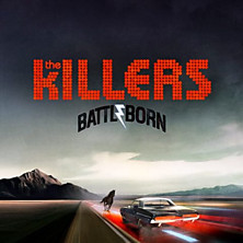
The Killers have a very strong house style throughout all their albums with their name being important in most medias they use. All their albums have the similar front covers with the name large in the mile and then some sort of scene in the background weather it is a city or desert. ' 'Sam's Town' differs slightly as their is a person in it however it is still the same idea as the others. The use of the light bulbs in the name helps to create a sense of showbiz.

Their videos are also often similar with many of them being shot in desserts, forests and similar surroundings, and the band are always performing throughout with a few cuts away to a narrative scene. There are strong links with the Album and each singles and vise versa and this helps to advertise and sell both.   
  
The obvious link between The Killers different album covers and also their music videos shows a very strong house style which helps to create a atmosphere in all of their products  this therefor allows the consumer to feel comfortable with their product and allows familiarity.

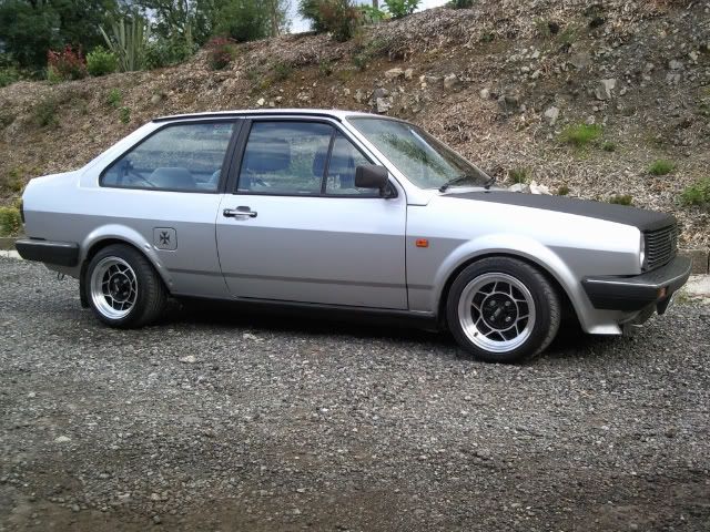
I believe that we should ensure that we use this idea and make a strong link between our album cover and music video. At the moment our recurring theme is a Volkswagen polo 1990 car (owned by a group member). There are parts of the video where the you can see the car being driven and we are also planning to use it for the album cover. My idea for this would to have the car parked in a deserted car park at night with the headlights on and the band members standing arround it leaning against the bonnet, roof and door.