Thursday, 18 April 2013

House Style


House style is one of the most importaant factors for a music video and Digi Pak. I looked alot into how other artist create this theme throughout and found that the link between a single video and the album cover is not that strong as the cover has to repersent all the songs on the album. However their is still a conection often in the way the video is filmed.
 In the Kaiser Chiefs first Album employment I noticed a link in the way both the video and cover are dingy and dark. This is and idea we may use in our product however instead of the dark dingy colors we will use bright and vibrant colors.


Sunday, 24 March 2013

Evaluation Question 3

What have you learned from your audience feedback?

We gathered audience feedback on two separate occasions regarding our music video, first we questioned people on their views towards our rough cut. After we made amendment and finished our video we again asked people on their opinions of the final piece in order to make our final changes.

Our rough cut in all honesty was poor as we had only a performance aspect. Therefor when we gathered our feedback it was fairly critical with comments such as...
  • "Hard to see the story line"
  • "Mish mash of shots"
  • "Incorrect casting"
Although negative these comments proved to be extremely help full as it gave us the drive to improve it significantly. Therefor after hours of filming and editing we had a full video which as a group we were all proud of. once this was complete we again gathered feedback from our peers by using different medias.
  • We shared our work on social medias such as facebook and twitter, and asked for people to leave comments. This form was a great way to get our friends and family to view the video easily and quickly.
  • Showed people the video and then interviewed them for their opinions.
  • A member of our group has a youtube account with almost a thousand subscribers, therefor the video was uploaded on there and we received some extremely help full replies.
  • Our video was also played to our class mates and we all shared our constructive criticism with each other, this was the most help full form of feedback as all of us were media student we understood what the video needed and could advise each other.
  • It was also uploaded onto a forum in which people with an interest in the area can view it and leave comments. 


We decided that it would be a good idea to film he interviews that we held. This was due to the fact that we could then look back over them and also show the criticism that we were able to build upon. The reaction to the Viewers can be seen in the youtube clip bellow.


The main feedback that we received was that some people felt that although the filming and editing was superb the actual story line was still in places hard to grasp. They said that this was due to the wide variety of shots and scenes. Therefore we decided to lose some of the scenes such as one of a man driving. After this the video clearly had more of a obvious theme running throughout.

Many people after seeing the improved version of the video believe that the intro to the song was one of the most effective parts and, Matt's extremely impressive computing skills allowed for us to use very technical equipment in order to film as if the camera was going through the window. The intro was very important as it allowed for the viewer to get an immediate impression of professionalism.

Another main cause for concern was the realism of the actors and the way they played their instruments, the lead singer and drummer were both perfectly in time, however some of the keyboard and guitar shots were not being played correctly. This however was easy to correct with some shots simply being re filmed and other edited to the time of the music. Also we used some shots of myself using the mixer and headphones in order to fill up any spaces where the instruments were completely out of time with the music.

We found that it was very important to record all the feedback we received weather by video or on paper. This meant that we could go back and look over them at anytime to insure that we were making the improvement necessary.


After the effects that the feedback had upon our music video we decided to use it with our Ancillary tasks also. And once again it had a extremely positive impact as many people believed that our initial idea of the album cover being of a car in a abandoned car parked had to many similarities between the single. This therefor made it look like a single cover compared to a album cover that is supposed to represent all the songs in the album. This knowledge then gave us a far wider scope to work with in terms of creative ideas and we came up with the idea of using ink in water, which can be seen in our final Digi Pak.
  • Bellow you can see a video I made showing the difference between our video before and after our second round of feedback. It is very helpful to show the changes we have made.

Evaluation Question 2

How effective is the combination of your main product and ancillary tasks?

I believe that not only are both our music video and digi pak high quality but also have a very professional finish, this therefor means that it has a strong house style throughout. The use of colour is one of the main parts of this and we have used it effectively within the music video and also the digi pak.   


The key area in which the main product and ancillary tasks combine is within the use of bright colours. it can be clearly seen in the way we choose the outfits and included the colour powder scene. This is then transferred to the ancillary task in the use of the coloured food dye. 

We did some research by asking people if they felt that the three products (video, album cover and advert) could realistically be related to the same artist. the feedback was positive with most people saying that they could see a correlation between the three. The theme of youth was said to be evident throughout with the 'modern' and 'fun' style that we used to create them.

For a band it is important to a wide variety of media to advertise there work, with this in mind it is evident that we have created a realistic and professional single that could be released to the public.

Sunday, 17 March 2013

Album Details

For the digipak, we needed to research all the little components that go into the design across all four panels and the spine. For this I looked closely at the album collection I had in my room - for example I examined the copyright text very closely. By having the albums in front of me I could read every word despite the fact that the text was almost microscopic. For our digipak, we need to make sure that we have all these little details in it to enable it to fit into the market of existing digipaks.

Below is a video (created on 'Animoto') of tracklistings (back panel on album). I looked at several designs and ways of structuring the tracklistings. As it is a single there will only be a few tracks to be put on the back but I looked at how albums do it. I considered factors such as the amount of space used, the structure e.g.) columns, text size, text style, images and house style on the rear cover.


What I discovered is that that there was a variety of ways that the tracklists could be displayed. For example, when looking at the 'R.E.M' cover, they covered the whole of the back using large text in capitals. Compare this with Coldplay's style seen in the albums "A rush of blood to the head" and "Viva La Vida" where the text is centred in small and detailed text which looks rather sophisticated. Where as the R.E.M cover is emphatic and in your face. So there is a wide list of approaches you can go for. The tracklistings are always in the same colour font as the name of the album which is on the front. It is very important that there is a consistent house style used in the design as all four panels have to lead on from each other.


There is a range of ways the background of the last panel is presented. A number of them are dominated by a photograph or graphic of something specific such as the artist, which takes up the majority of the space with the tracklistings in the corner. When the tracklistings are intended on being the focus of the panel, the background is simplistic and frequently plain (as seen above in the two albums shown).


Try our slideshow maker at Animoto.


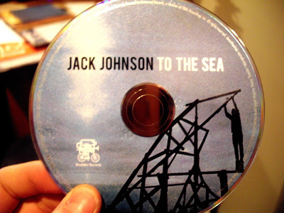
The copyright details are also shown on ALL album covers and the CD itself as this is a notification of which record label owns the rights for the artist and prevents potential copyright. This is usually printed on the back panel and regularly on the third panel in VERY SMALL text. For example on the Jack Johnson album 'To The Sea' it says, "2010 JACK JOHNSON. The copyright in this sound recording and artwork is owned by Jack Johnson and is exclusively licensed to Universal Records, a division of UMC Recordings INC. All rights reserved. Unauthorized production, copying, hiring, lending, public performance and broadcasting is prohibited. BIEM/SABAM. Made in the EU." It simply highlights the legal points around the outside of the CD itself. This quote is generally the same sort of thing on all albums in terms of the wording.

The barcode is obviously for sales purposes. It is usually placed on the back (fourth panel). The positioning of it differs in the sense that i can be on its side or not. In terms of placement it is 9 times out of 10 along the edge hidden away as it does not carry any style or meaning for the album itself. So it is rather unimportant in terms of design. As long as we put it on there at the required size, that will be fine. As seen here there is some promotional material above it such as the record label's website etc.


Other little things that can be seen on a digipak are touches such as the label logo as seen on the Jack Johnson album which just gives it more of a branding and identity. For our album we can create a record label for this purpose or simply just use the record label that the band use - from whom we took the song for the video (The Naked and Famous)

First Idea


By Matt Dickinson


This is the first idea i had for our music video album cover. The picture is the car we used in some of the filming, especially in the opening shot of the music video.


Planning


Construction


To create this shot i first took a photo of Dom's car when we out on a snowy day (Hence the icy floor) because of the cool lighting form the street lamps. I set the ISO low and the aperture high then contrasted this with a long shutter sped so only the light trails from the background traffic were captured instead of the individual cars. This meant i could use this to relate this car shot to the steel wool photography as they both were capturing light trails.


I then imported this photo into photoshop and cropped the top and bottom so the car was more centred. I added a gradient map of a turquoise colour and changed the blending options to soft light to bring out the shade and tint in the car paint. I then increased the mid-tones and exposure to overall increase the lighting/brightness. You can see the photo difference below.


Once i had the photo i then created a file that was the exact dimensions of a album cover, (4.75" x 4.75"). I wanted to try out this sort of blind effect that i had seen before so created a black rectangle layer and duplicated it 10 times across the front of the album cover. I was going then going to fill the black from the text with a picture, the car. Firstly though i saved this twice, as the album front cover and album back cover to make sure they were identical to each other.
I then imported the saved Jpeg file of the edited photo as a new layer i then placed this above the black lines layer and created it as a layer mask so the photo only showed where the black lines layer was. This created a really cool effect but the light lines just weren't as obvious as i wanted them to be so experimenting a little i duplicated the layer mask and released it as a separate layer. I then changed the blending options of the duplicated layer to screen so only the light would show and not the dark areas. Then i moved the top images a few pixels to the left which gave it a really trippy 3D effect that messes with you eyes.


Then i had to move on the wording of the album cover. Luckily in "Young Blood" both words had five letters so in a simple plain font i over-layed each individual letter in separate bars on two rows. I then just rearranged the Naked and Famous logo in some text in a weird formation to fit into the bottom corner but this wasn't going to be the final logo design for them so i wasn't really too bothered at that moment in time to get it perfect (we have another post out soon experimenting with logo designs for both ancillary tasks).


I then saved this and deleted this half of the photo. For the back cover i then removed the text and moved the photo over till the rest of it was in shot. However the photo wasn't long enough to cover the whole background so i trimmed the photo to only cover a few bars and then fade out into black.


Feedback


Feedback was overall positive about the album cover and artwork. Our teacher said it looked very artistic and had a very idea for the album cover however the task was to design an album cover not a singles cover. Which meant this was completely wrong. It didn't have the name of the album "Passive Me Aggressive You" on the front which is the key essential and neither did it have any of the sings on the back. Also there was no coherence between the idea and the album name. Overall was a good idea to the wrong task. This meant we had to go back to the drawing boards.


Equipment

By Dom Lake


Posted As a group we were thinking of different ways to add some simple touches to our blogs, one of which was the animated .GIF's. These were really simple and easy to make although quite time consuming.
The basic idea is to make a background that is completely blank and place the item that you wish to animate in the center of the set, we then took a photo and then rotated the item around a 1/12 of a turn, the more photos will mean a smoother animation but 12 is enough.
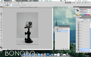
After the photos have been taken we then imported them to a computer and loaded all the 12 images into photoshop layers in the same image as you can see here. This is simple to do, but i personally choose to open them in Bridge and then highlight the photos i need then load them into photoshop layers as i personally think its quicker.


After that is done you then need to go to >Window and choose >Animation and then this window at the bottom will appear with all the photos from the layers.
Then press the play button to check to see if there are any repeated photos, if there are then click on the photo that is repeated and then click the dustbin icon to get rid of it.


From there i then checked the timing of the animation, if the timing was slightly wrong, i changed it using the drop down menu underneath each of the pictures, i chose 0.3 seconds for each photo.


After that, the file then needed to be saved as a .GIF, this can be done by going to >File >Save for Web and Devices, this then brings up another window in which i chose the file type as a .GIF then lastly click save.

Performance Planning


By Matt Dickinson


Click on the image to view my Prezi on the planning for our performance part of the music video. I made this shortcut for the presentation - the interactivity of the presentation is a lot more interesting to watch and more engaging than perhaps text and images on the blog


The performance is due to be the base bulk of a our music video, it is what

we can fall back on if other parts of the narrative goes wrong.


Therefore it was key that we tried to film as much as we can from every angle so


we were never short of footage when it came to post production especially as we


only have narrative shots edited into the timeline at the moment making up a few


minutes of the video. From looking at previous reports of people filming music


videos our teacher told us that the most important part is to make sure we have a


variety of different angles and distance shots (close up to long shots) to ensure a


consistency and fluidity of the video.


The first thing i did to look into making music videos online on youtube and there were a handful of videos which could give us tips and tricks on what too do. One video in particular was a lot of help, by Film riot. This is a channel dedicated to amateur cinematographers and how to improve so it was perfect.


It helped reinforce the importance of aspects like lighting, perspective and how shots can be manipulated in such ways to appear differently to the viewers on screen. Which could help us make our zero budget music video look a lot higher quality. The video is below.


So first thing first we focused on lighting, as this was primary going to make or break our music video. We looked around and found that FIlm riot had produced another video on how to light your scene which was very helpful however it brought our confidence down as it showed the reality in the amount of lights needed and the quality/colour of the light needed to get a professional and "fitting" look.


Also what we need to look at is what lights are going to be out of and in the shot. For Example in the picture to the side in side the shot is the light of the lamp. However that is not powerful enough to produce enough light so the camera can record on a low ISO and have a low amount of noise therefore they have included to external lights. One spotlight which will direct light in the same path of lamp making the viewer assume the lamp is stronger than it is and a background light to increase light of the overall scene.


Contrast can always be increased in post production to darken the background again but the difference will be that the shot will have no noise in the image which is something we may struggle with.


Back to colouring the image it is essential that even that colour correction can be applied in post production after, natural coloured light originally shot will improve the quality of the image and reduce extra work in post. This can be achieved a number of ways. For example Halogen lights are primary orange so if you want a cold blue sort of atmosphere then you are going to have to look for another bulb or filter to produce this tone and wont be seen as a safety hazard. I created a small comparison photo below showing the impact of tones below.


Planning this would be essential then to try and prevent us having to go back and re-film certain parts. Therefore i decided to make the scene of the performance entirely from scratch in a program called Cinema 4D (Modelling Software). This would allow me to play around with the lighting of the characters and to look at the layout of the band.


Finally finishing the model i came up with the following to mimic the band. Two Guitar players, Drummer, Keyboard and Main singer. However only one guitarist is actually needed i did this just to be safe.


Looking at lighting i knew i wanted a warm feeling to the performance as the song was connoting enjoyment of youth. Therefore i wanted a weak orange light to be included from the front not too bright to complete light the characters but enought to distish there features and create a glow about them. I then produced a three single a lot stronger neutral lights from behind to create the silhouette feeling we wanted to create as shown perviously on the pitch.


From the video you can see me playing around with lighting to get a fair distribution across all actors so individuals weren't singled out and parts aren't missed.


We then produced a list of what lights we were going to use in this process then. The first lights we were going to use were my high powered lamps which produce a bright orange tinted light which could be pushed as some of the lights in the background to give the spotlight effect effect we wanted. However i don't think these will be bright enough to produce the backlight. These will be placed more in the corners at the back to give the actors some contrast light on their sides and hopefully produce a sort of halo effect.


Then we also had two flood lights which are primary used during construction and are perfect for lighting up big areas. We are going to put this right in the centre at the back of the hall to produce the main beam to light up the backs of the actors also producing this halo, silhouette look. However these are extremely hot so care will have to take care to how long we can leave these on.


Finally we have a Long Panel LED light which is no where near as bright as the other lights. However it produces a crisp white colour which reacts very well when on skin. We are going to use this as our front light to gently increase the tone and exposure on the singer and front men in the actors. The light isnt bright enough to have a serious effect on the actors making them squint etc hindering the performance however will just create a small contrast making features more distinct.


We also are going to make sure we have extension leads so that all the lights at the back and other things can be correctly positioned without having to worry about a plugs.


Next on the list to plan was the equipment actually we would use to actually film. We had two cameras that were available to shoot HD 1080 at 30fps which were the Cannon 550D (below left) and the Nikon D3100 (Below Right). We have a number of lenses available to use each can there own affect from an fish eye to zoom and prime lenses. For more Information on the lenses and their uses check out our lenses post. Each camera had 8 Gb card so we will bring our laptops with us and charges as there were multiple plugs available to clear the cards when full so we wont have to worry about the amount we can film.


I also am going to bring my speakers to the hall to make sure we have a secure and loud base to play the music across. This will allow the drummer to play properly and in time with the beat making it easier for us to edit and the others to still here the song with the drummer behind them. Also the louder the music hopefully the more the likely they are going to be able to get into the song as if it was there own making their movements and actions seem more natural on camera.


Finally our secret weapon to the video will be a smoke machine that we were able to get a hold of through a friend. This produces no toxic smoke a press of a button that we are planning on using towards the end of the video just to add some movement to the background of the filming making the clips even more dynamic and interesting.


Colour Powder

For our colour fight scene we are aiming for it to portray a very energetic feel and atmosphere to suit the song. There will be many close ups of the actors faces to show emotions and reactions while the long shots of the actual action scenes. To give some examples of the footage we are trying to recreate i have put together this post to try and share the insight of what i had in mind.


Above and below are some photos taken from the "Color Run" website (Yes its american) which is a run in many cities across the US to help raise money for a charity of choice. However throughout the race and after the participants cover each other in colour powders for fun. This is the same powder that i have got called "Rangoli Powder" which can cover and stick to the skin but does not stain which means we can wear good quality clothes and not be worried about the powder staining these. This also saves us buying clothes just for this shot. However we are going to ask the actors to wear quite minimal and simple clothes so the powder stands out for the camera.

This is a video produced by a amateur film director called devin "supertramp" where he filmed the festival of holi in india also known as the festival of colour. This is also shown in my pitch post. However also below is the behind the scenes video of when he was filming and this is helpful to see how we can recreate something very similar to his work.


The pictures of the packets of powder we have is below. We made sure we got alot of bright and warm colours such as orange, yellows and pinks to connote happy upbeat and enjoyable atmosphere. We are going to make sure that each of the actors have there fair share and are covered in it to show their enthusiasm.


As you can see they come in small little packets which will allow us to split them easily and may even lead to us being able to throw them easier at each other instead of just throwing the powder itself. Either way there is no way to test this without wasting powder so we will have to leave it to when we actually want to film the scene.


Even though we are using coloured powder which is extremely unpredictable we are still going to be using the DSLR we have to film.

To protect these from the colour powder we are going to do a number of things. Firstly and most importantly is the lens which i have some clear cheap lens filters to cover and protect the lens from harms way. This will prevent any permanent damage to the lens and are easy to replace.


The second thing is the actual body of the lens. Colour powder could get into all the small holes and compartments of the camera completely destroying it and making it very dirty at the same time.

As we didn't have any money to buy housing to protect it from this sort of "environment" i thought it would be a good idea to cover the cameras in cling film. A cheap and easy option which is easy to cover the camera and still have access to nearly all the buttons quickly.

Then the cling film can just be chucked away after with no washing due to the low cost. We made sure we left the lens uncovered due to the lens filters and we still had access to watching the footage as the cling film is clear while being being thin enough to press all the buttons. The only slight issue was manually focussing and zooming which meant we went though a lot of cling film.